Quick Reminder: Tuesdays on the blog we'll be focusing on advanced topics. Today's topic relates to motion charts, one of the new enterprise features on Google Analytics.
Example: Spotting a spike in traffic using the Keywords Report
Spikes often deserve special attention when analyzing your site. They can indicate interesting developments in your industry, marketing impact or press coverage. Here are a couple of examples of situations that might cause a spike.
- The number of visits from a certain referrer, such as stumbleupon.com, suddenly jumps when a blog post gets attention
- Your conversion rate falls to zero because of an error in your signup form
- Your percentage of new visitors suddenly increases from an event sponsorship
- Your bounce rate spikes due to a redirect error
Navigate to the Motion Chart
To load the Motion Chart, start by navigating to the Keywords Report:
Click on "Visualize" across the top of the Report to load the Motion Chart:

Look for Sudden Movements
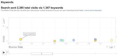
Next, press the play button. Here are two shots from Keywords Motion Chart on purevisibility.com, at different points in time:

Notice how in the first screenshot, all of the bubbles in the chart hover in a line above the X-axis? This trend continues for most of the period.
In the second shot, we see an exception to the trend: on a single day in the period, the bubble for the keyword “pure visibility” moves to the very top of the chart.
Find the Cause of the Spike
What does this spike mean? On a basic level, it means more people came to your site from that keyword. A better question is "why did it occur" and "how can I get it to happen again?!"
Start by looking at your marketing & events calendar. Did any new advertising campaigns launch? Did an email go out or a conference occur? Next take a look at press coverage. Did any articles come out that day that might have drawn attention to this keyword? Did your competitors do anything significant?
In this example, it turns out that the high number of visits from the keyword "pure visibility" correlated with a local speaking event by a Pure Visibility employee.
Take Action
The company could use the information gained from using the Motion Chart in order to
- Calculate ROI on the speaking engagement
- Allocate more (or less) time and money to speaking engagements
- Start developing custom landing pages for each speaking engagement to generate more leads
- Set a conference schedule that maximizes ROI
- Focus on cases where significant movement is limited to a smaller number of the total bubbles. Sometimes, multiple bubbles in the chart move significantly. You might find yourself asking, are these spikes equally important? A general guideline you can use to assess the relative importance of spikes is to look at how much the other bubbles in the chart move. If all or most of the bubbles change position drastically throughout the time period, then the spikes probably aren't very important. If a single bubble moves drastically while the others stay in roughly the same regions, you might have found something interesting.
- Ask questions to find out what marketing and company events might help explain the trend. Related online (and offline) events are often the cause of traffic spikes from a segment. Keep a detailed schedule of the dates when new advertising campaigns are launched, whether paid search, TV, or print advertising. Keep track of corporate events, news, and press releases, and don't forget about events that may have impacted the industry at large.
- Look to other reports to confirm the trend. In cases where you observe a spike but aren't yet sure why, dig deeper using additional Google Analytics reports. Often, a spike in traffic from one segment will be reflected by spikes for the same dates in another report. Try comparing Keyword, Geographic Region, Traffic Sources, or Conversion data as you hunt for clues. For example, doing a Date Range comparison of the days directly before and after the spike might show us a similar spike in the traffic from a particular geographic region. Additional information like this might be enough to help explain the cause of the spike.
With a little practice, Motion Charts can become the backbone of all your visual analysis, saving you time and helping optimize your marketing campaigns. Check out some of the following resources for more information:
What events caused traffic spikes on your site? Any helpful tips for analyzing spikes?


