Wednesday, 11 March 2015

It's common for Google Analytics users to use spreadsheets to analyze their Google Analytics data or combine it with another data source. But exporting your data from Google Analytics to Google Sheets is a manual process, and it can be tedious if you run reports frequently or manage multiple accounts. With the release of Add-ons for Google Sheets, getting your Google Analytics data into Google Sheets has never been easier!

Add-ons allow you to extend the power of Google Sheets by automating common tasks and integrating with external services. The Google Analytics Spreadsheet Add-on allows you to access your Google Analytics data, right from within a spreadsheet!
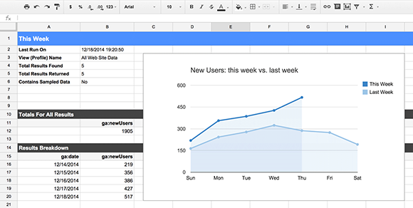


The Google Analytics Spreadsheet Add-on
The Google Analytics Spreadsheet Add-on combines the power of the Google Analytics API with the rich feature set of Google Sheets, making it easier for Google Analytics users to access, visualize, share, and manage their data. With this add-on you can:
  • Query and report data from multiple views.
  • Compute and display custom calculations.
  • Create visualizations and embed those visualizations on third-party websites.
  • Schedule your reports to run and update automatically.
  • Control who can see your data and visualizations by using Google Sheets' sharing and privacy features.
But perhaps the best way to find out what the Google Analytics Spreadsheet Add-on can do is to see it in action. In this short video I introduce the add-on, show you how to install it, and walk you through creating your first report.


If you want to go deeper, you can watch this more advanced video where I explain in detail the process of building a complete dashboard that automatically updates and can be embedded on a third-party website.


If you have more questions about how to use the add-on, check out the documentation. It explains each of its features and configuration options in much more detail.

Supermetrics and Analytics Canvas add-ons
The Google Analytics Spreadsheet Add-on gives users a powerful yet user-friendly way to access their Google Analytics data, but it doesn't solve all business integration needs.

For more advanced business and data-integration solutions, I strongly recommend trying out these two excellent Google Sheets add-ons created by our technology partners:
Both of these add-ons integrate with Google Analytics as well as a variety of other platforms and services such as Facebook, Twitter, Microsoft Office, and many more. Free and premium versions are available. 

Feedback and Support
Add-ons are a great way to automate the process of getting your Google Analytics data into Google Sheets. We hope you take the time to try out these add-ons and see how they can improve your workflow.

If you use the Google Analytics Spreadsheet Add-on, we'd love to know what you think. You can leave a review in the Chrome Web Store, ask any questions you have in the add-on discussion group, or submit feedback directly from within Google Sheets.

Any and all feedback is welcome!

By: Philip Walton, Developer Programs Engineer, Google Analytics

Thursday, 5 March 2015

Successful developers understand that in order to have a popular app, focusing on retaining a loyal user base is just as important as driving new installs. Today at the Game Developer Conference in San Francisco, we introduced new reports that will help you measure how to do this in two meaningful ways. We’re happy to announce that Mobile App Analytics will now let you understand how users come back to your app day after day, and provide the rich insights you need in order to measure their value over time. Let’s take a look at how these new reports can help make your app a hit.

Active Users
The active user report displays your 1-day, 7-day, 14-day and 30-day trailing active users next to each other in one, easy-to-view dashboard. The new overview gives immediate insights into how users interact with your app over time, along with dropoff rate comparisons. With this report, an app download is only the beginning of a potentially valuable relationship with your new users.

Benchmark active users at 1-7-14-30 days by selecting the segments you want. (Click to enlarge image)
While these metrics help you monitor your active user trends, when put into context they can answer important questions about your user acquisition strategies. For example, if you are investing in different campaigns, you can compare the cost of retaining users acquired via paid traffic versus organic to understand if you are attracting the right type of users. Not only can you measure your cost effectiveness, but you can also continue to monitor whether or not the users you paid for are still coming back after the campaign is over. This is particularly important when trying to keep your loyal user base engaged and happy with your app.

Lior Romano, Founder and CEO of Gentoo Labs (the makers of  Contacts+ for iOS and Android), was one of the first customers to try out this new report during our beta test period. He found the Active Users report especially useful when managing and organizing all their information at-a-glance: “We love the new Google Analytics Active Users feature -- it's a real time-saver! We get a quick overview of the 1/7/14/30-day active user trends side by side in a snap, which helps us to easily track our main metrics.”

Cohort Analysis
After learning how many users have opened your app, the next step in driving engagement is understanding when they come back. Cohort Analysis is a user analysis technique that allows you to analyze and compare your users by looking at their customer journey. Using Cohort Analysis, you can see when users are coming back to your app and their behavior over time after the day of the first session, and lets you further filter the information by day, week or month. We’ve also added the ability to compare different segments of users based on the day of the first install. 

In order to validate your user acquisition strategies, Cohort analysis lets you compare different periods or campaigns. For example, you can compare different weeks or months to measure the retention effectiveness of a single channel to see if you continue to attract valuable users throughout a campaign. The flexibility of the report also allows you to see how much time users are spending in an app as they come back day after day. With these valuable insights, Mobile App Analytics users can tailor their acquisition campaigns or app experience, just as our partner E-Nor did: “Cohort analysis in GA made it easy for E-Nor to gauge the effectiveness of lead nurturing efforts during an app free-trial promotion campaign. The analysis clearly showed that many users responded well to email and in-app reminders, resulting in over 50% retention between the 3rd and 5th day post sign-up as opposed to 30% in the first and 2nd day.”

See at a glimpse when users are coming back to your app. (Click to enlarge image)

Lifetime Value
Analyzing retention is a great way to ensure users stick with your app and come back day after day. With Lifetime Value reporting, you’ll get a full picture of these users’ value over time. To get the most out of this report, it’s important to start with a clear definition of what a user’s value means to you based on your business objectives. Once you’ve defined the value, you can access the report to measure certain variables such as revenue per user and number of screen views per user over a period of 90 days. For example, if the goal of your app is to get users to purchase virtual or material goods, you’ll want to use this report to get a clear view of when they make a purchase and how much they are spending in your app over time.

Lifetime Value is a key metric to use to measure the effectiveness of your acquisition campaigns. If your cost to acquire a new user is higher than the average value over time, you might want to optimize your campaigns to meet the lifetime revenue they generate. Lifetime Value is particularly valuable if you offer in-app purchases, but it can be applied to discovering many other useful insights, such as number of times they open your app, total number of screens and goal completions.

Session duration per users compared to goal completion over a 60 day window. (Click to enlarge image)

How to get started
Cohort Analysis report can be found under the ‘Audience’ section in your Google Analytics account, and is now available in beta. Lifetime Value and Active Users reports are coming soon to all Analytics accounts.

To get started login into your Analytics account and look for the new reports under the Audience section. 


Posted by Gene Chan and Rahul Oak on behalf of the Google Analytics Team

Sunday, 1 March 2015

We have put a tremendous amount of effort into making Google Analytics more intuitive and easy to use. The hard part is teaching people how to use their insights to drive action. We hope to change that with the introduction of our very own Google Analytics Playlist on YouTube. Here you can check out full-length presentations on advanced analytics implementation, best practices, how to create a data driven culture and more.

We have a solid lineup of videos to start with taken on August 1st when we held our first ever Google Conversion University event. It was attended by 100+ representatives from major companies across all major verticals. Attendees got the chance to share ideas, meet with our team, and listen to some great presentations on optimizing their web analytics experiences. You will find those presentations, filmed live in August, now on YouTube.

Those of you who want to pick up a few quick tips might be interested in 'Bounce Rate: The Simply Powerful Metric ', 'Non Ecommerce Sites: Beyond Averages...', and ' Context and Actionability in Web Analytics' by Avinash Kaushik, our resident Analytics Evangelist, blogger, and author of Web Analytics: An Hour a Day. We also have the complete sessions, including an introduction to Conversion University by Brett Crosby, Sr. Manager, which provides perspective on the evolution and direction of Google Analytics. Stephanie Hsu covers key reports for the optimal AdWords campaign. Alex Ortiz touches upon a number of advanced techniques such as segmentation through filters. And Tom Leung covered how to enhance your entire user experience using Website Optimizer.

In the future, you can expect more in-depth content about the Google Analytics product to be filmed and posted here in this Playlist. These videos are a great source of insight into how you can continually improve your web analytics practices, and even into our own team here at Google. We hope you enjoy them.